On This Page
Customize the Unified Checkout Look and Feel
Unified Checkout
Look and FeelFollow these steps to customize the appearance of
Unified Checkout
in
the Smartpay Fuse Portal
:- Log in to theSmartpay Fuse Portal:Production URL:If you are unable to access this page, contact your sales representative.
- In theSmartpay Fuse Portal, go to the left navigation panel and choosePayment Configuration>Unified Checkout. TheUnified Checkoutcustomer experience page appears:
Figure:
Unified CheckoutLook and Feel Merchant Experience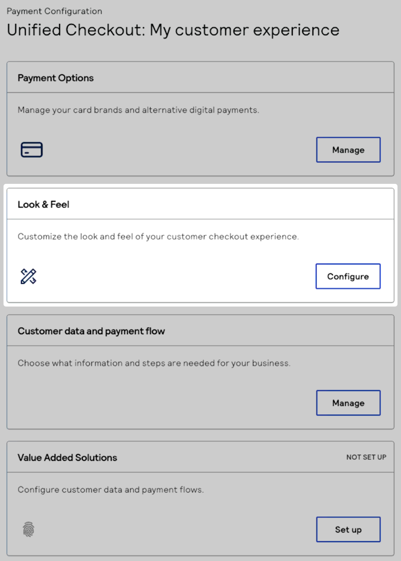
- In the Look & Feel section, clickConfigure. The Look and feel page appears.
- If you want to use AI to determine the look and feel, under AI brand studio, clickBrowsethe upload a screenshot of your website. These components are updated using the colors from the screenshot you provide:
- Button list background color
- Card checkout outline and text colors
- Header and checkout font background colors
Proceed to the next steps to manually customize these and other components of theUnified Checkoutappearance. - Under Button customizations, select the options for your button list. These customizations are available:
- Universal Button Shape
- Use the Button shape drop-down menu to select if you want a sharp corner, rounded corner, or pill button:
Figure:
Unified CheckoutButton Shapes
- Button List
- Use the color selector or enter a HEX code in the Button list background color text box to customize the background color of your button list. To review the button list preview, see Button List.
- If you uploaded a screenshot in the AI brand studio section, a color is entered in this space based on the colors present in your screenshot.
- Card Checkout andClick to PayButton
- Use the card checkout button label drop-down menu to select the text that appears on the checkout button. These text options are available:
- Pay with card
- Card payment
- Checkout with card (default)
- Debit/Credit payment
- Donate with card
- Subscribe with card
- Card Checkout Buttons
- Use the button style drop-down menu to select if you want an outlined or filled checkout button. Select the button fill and text colors using the color selector or HEX code:
Figure:
Unified CheckoutButton Style
- If you uploaded a screenshot in the AI brand studio section, a color is entered in this space based on the colors present in your screenshot.
- Under Checkout customizations, select the options for your checkout experience. These customizations are available:
- Font
- Use the font drop-down menu to select the font you want to use. These fonts are available:
- Inter
- Monserrat
- Open Sans
- Raleway
- Roboto Slab
Figure:
Unified CheckoutFonts
- Select the background color using the color selector or HEX code.
- If you uploaded a screenshot in the AI brand studio section, a color is entered in this space based on the colors present in your screenshot.
- Header Customization
- Select the color you want to use in your header using the color selector or HEX code.
- If you uploaded a screenshot in the AI brand studio section, a color is entered in this space based on the colors present in your screenshot.
- ClickSave and publishto save your look and feel customization. The Ready to publish popup window appears.
- If you are done editing, clickPublish nowto publish your changes. If you need to make more changes, clickKeep editingto return to the Look and feel page. To review your changes, click through the example screens. For more information about the UI previews, see Look and Feel UI Examples.